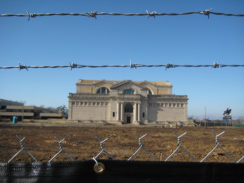
A few years ago I attended a talk by architect David Chipperfield in the auditorium of the St. Louis Art Museum. In discussing the design approach for the then proposed museum expansion, Chipperfield said that the design would respect the original Cass Gilbert museum building. Upon seeing the proposed design, and now having seen it constructed, I am not so sure that respect is the word I would use to describe how the addition treats the Palace of Fine Arts. Above is a last view of the east elevation of the museum in January 2010.
 I am not so concerned with the design of the addition structure itself. It is certainly not a stunning design that you will see splashed across the pages of architectural periodicals, but it is not an awful design either. The renderings of the interior lead me to believe that once inside, the addition will be quite attractive.
 I am thrilled that the museum will be gaining additional gallery space, which will theoretically allow for the un-crating of a percentage of the museums large collection of works that sit in storage due to lack of space. I am not so thrilled with how the new Chipperfield addition relates to the original museum. One problem is how the new building was attached to Cass Gilbert's masterpiece.
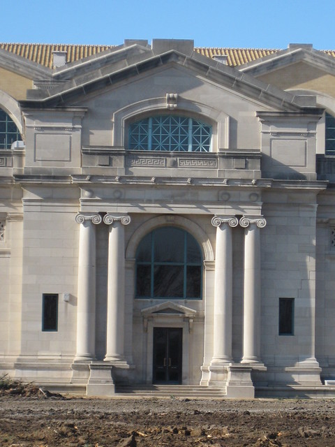
This was the east entrance of the St. Louis Art Museum just before construction of the addition started. The entrance had not been used as an entrance for many years (possibly decades), but the lack of functionality did not diminish its presence. Once construction commenced, I have been told by two different sources, that the beautiful stone engaged Ionic columns were unceremoniously chiseled off of the building! It remains to be seen what other other changes were perpetrated to Cass Gilbert's work, but my guess is that the stone doorway, pediment and arch met a similar demise.
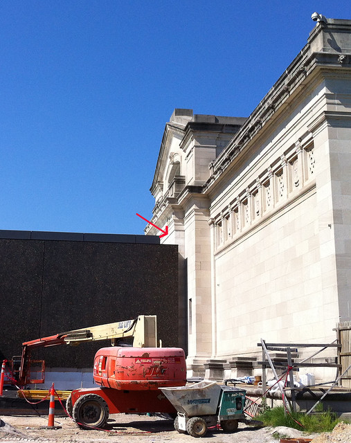
The entablature of the east entrance survives but is nearly hidden behind the solid black box that has smashed squarely into the east face of the museum. Where the columns were removed, flat stone has been added to meet the new addition. This complete lack of sensitivity to the historic fabric of the original museum is unprecedented in even at the height of the modern era when so many classical buildings were defaced.
 This is a 1959 model of a multi-phase museum expansion designed by the architectural firm of Murphy & Mackey (image from Missouri Digital Heritage). Notice how the planned east and west wings would have attached to Cass Gilbert's Palace of Fine Arts only at the flat portion of the stone facades, below the decorative frieze and leaving the east and west entrances fully intact and functional leading to secure outdoor sculpture courtyards. Only the south wing of this plan containing the auditorium and restaurant was executed, opening in 1960.
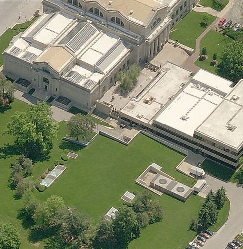 In 1978, alterations and an expansion of the south wing by Kivett and Meyers actually removed the two portions of the Murphy & Mackey addition that had attached to the original building at the main floor level, leaving only the lower level connection. While the Kevett and Meyers alterations wrapped Murphy & Mackey's auditorium with what looks more like a suburban office building, it paid the utmost respect to Cass Gilbert's original museum. Removing the mostly glass main level connection immediately adjacent to the south entrance though did make getting to the restaurant and auditorium somewhat awkward.
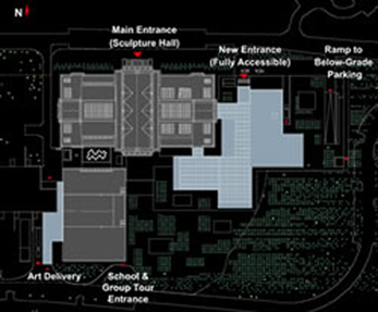 Beyond how and where the Chipperfield's addition attaches to the existing museum, there is the relationship between the new structure and the existing museum. Instead of configuring the addition so that there could be usable outdoor courtyards like in the Murphy & Mackey design, Chipperfield left only about a 20 foot gap. This is just enough to let light in windows, but too narrow to be a useful space. In placing the building so close to the existing museum, much of Cass Gilbert's south and east elevations are unintelligible.
This is a view out of one of the lower level windows in the original museum showing the close very proximity of the new addition.
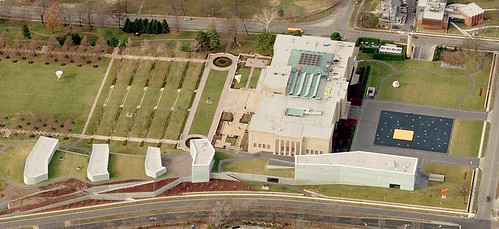 In complete contrast to the addition to the St. Louis Art Museum, Steven Holl's solution to adding space to the Nelson Atkins Museum of Art in Kansas City provides 165,000 square feet of galleries, offices and other facilities without overwhelming the original 1933 Beaux Arts structure. The addition was completed in 2007.
 The connection to the new addition occurs at the Beaux Arts building's lower level, so that all elevations of the original structure are completely unencumbered by the new building. Much of the addition was constructed below grade and has grass covered roofs punctuated by the glass "lanterns". The addition is quite spectacular at night and overall it is a much more dynamic building than Chipperfield's conservative solution. Steven Holl's website project page has several great photos.
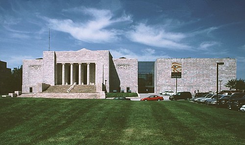
For the addition to the Joslyn Art Museum in Omaha completed in 1994, Sir Norman Foster restrained himself from his usual high-tech designs with a simple large box clad in the same Georgia pink marble as the original 1931 Moderne museum. The addition nicely compliments the museum and attaches to a large area of the side of the structure. But original facade is fully intact and becomes the interior wall of a large glass atrium that connects the buildings and functions as a lobby, sculpture space, cafe and event space.
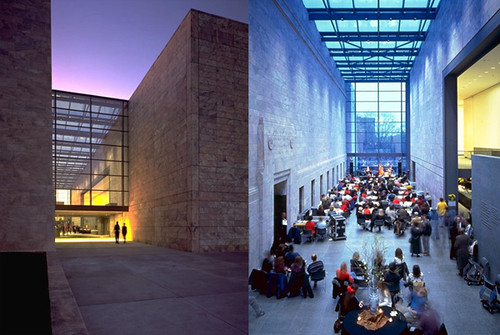
Joslyn image sources: exterior, atrium
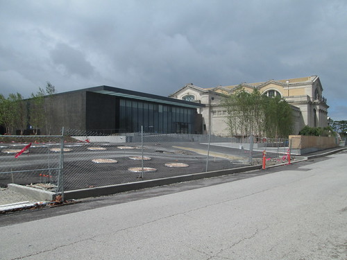
Between the drop-off drive in front of the new front entrance and the ramp to the new underground parking garage, which accounts for over 60% of the square footage of the addition, is a sea of sloped asphalt with groupings of round openings, which I would presume to be tree wells. This is not exactly the most attractive material choice compared to the materials of the building itself, and yes the sidewalks are asphalt as well!
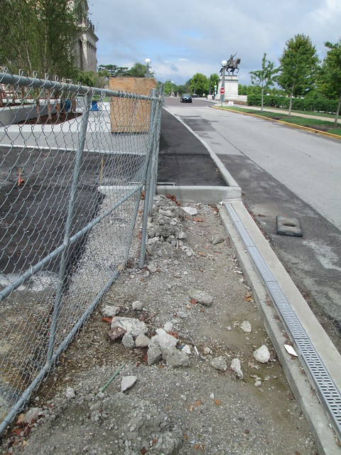
The corners of the driveways for the entry drop off and garage ramp are square, which I'm sure looked good on a plan, but won't work so well in reality since cars don't turn at right angles. All of the driveways also lack accessible curb ramps at the sidewalks.

8 comments:
"Once construction commenced, I have been told by two different sources, that the beautiful stone engaged Ionic columns were unceremoniously chiseled off of the building!"
WHAT THE F*CK! Given the endless number of ways they could have connected the buildings why in the hell would they do this? WHO THE F*CK DOES THIS?
Well, apparently, in their zeal for, and of course, subsequent glee from, acquiring a "world class architect"tm for their project, the Trustees appeared to have lost not only their good sense, but their good taste.
If this came from the mind of Mr. Copperfield, one can only come to the conclusion that he is a world class douche. But of course the Trustees have their own part in this shameful vandalism. Poor Cass, trumped by time and the ill-bred, in-bred rubes on the Museum board.
"Ehermgerhd! Mr. Copperfield wants to slab off the east entrance for his masterpiece? But of course, HE'S A WORLD CLASS ARCHITECT!"
Ugh...
I have recently read an article about how the former Mayor Bosley Jr. had purchased a small piece of property on Delmar to make some housing and a BBQ restaurant. He bought it for $150,000. They were unsuccessful. Then, a few years later, the head of the History Museum had made a deal to buy that same property from the then-Mayor, for $850,000. Since then, there is nothing that has been built on this spot. What we forget as citizens, is that how the building looks and how much of the old building is damaged, does not matter. The fact that the people stuffing money into their pockets on the board, got this world class architect, is what has given everyone and intellectual boner. Will this look like crap? Yes. Will the people of STL and all tourists be stuck with this look for a long, long time? Yes. Could the Museum have saved millions of dollars by getting a local designer and continuing the tradition of the stone facade building? Yes. But, that would only make us happy. People in these high positions in STL remind me of the antagonists from the movie "Trading Places". They ruin and mess with people's lives, for a bet for $1.
I wouldn't be surprised if the new expansion puts an entrance fee now in the whole museum. This will cause people to stop going. Field trips full of hundreds of kids will stop going to the Art Museum. The Museum starts to cut back and raise prices, then in 30 years, it closes.
Chipperfield?! I've been reading 'Copperfield' ever since I first read about this guy a decade or so ago. The brain sure does strange things.
Damn, my wife is gonna get a kick out of that.
I think we should call it the Churkendoose. How was this allowed to happen? Is it not covered by any historic code? All they had to do was go and look at the history museum to see the proper way to attach a new building to an old building. This place looks like a big box store...Parking lot in front for flare??!!! This is a case where a starchitect put his vision above the existing structure and the love that people in the region had for it. The whole composition has been ruined!! It could have been contemporary and still been in harmony to the existing building. Even its color and materials are in direct contrast to the original building. The columns can be replicated..Costly, but possible. Now we are stuck with this Churkendoose of a building for a long time. Maybe if it is ridiculed enough the museum board will wipe the drool off their chins and start a campaign to build something contemporary, but not absolutely terrible...Maybe in 20 years.
I believe that Britain's Prince Charles had a good description for this sort of thing: a monstrous carbuncle. He was, of course, referring to another building design for the National Gallery, but it still fits.
Full quote: ‘What is proposed is like a monstrous carbuncle on the face of a much loved and elegant friend.'
Years before the Art Hill project got started, and the selection committee was looking seriously at Chipperfield, I thought to myself how much his work all looked like the generic stuff Mrs Emily Rauh Pulitzer was so fond of; you know, suburban blocky office park Bauhaus concrete bunker stuff you see everywhere? Mrs. Pulitzer had a lot of say in Chipperfield's selection, or so I've heard.
And I said to a friend way back then: this guy is going to get the job because Mrs. Pulitzer likes that stuff, and the result will be something that looks like a non-descript office building/library (which it does), but when its finished everyone will say what a revelation it is, how stunning it looks, and how fortunate we are to have such piece of work by this giant in the field of architecture, etc. And it's turning out that way.
It seems to me we've been here before way too many times before. We never learn because we're afraid that if we disagree with the likes of Mrs. Pulitzer, et al, that we'll look like a bunch of Rubes. Instead, we end up looking like a bunch of Yokels who got the shaft again! Too bad Chipperfield's design makes Cass Gilbert's lovely Beaux Arts beauty look so awfully bad!
^ Thanks for the insight. Very interesting about Mrs. Pulitzer. This makes sense when you look at her museum, by a far superior master of concrete. Too bad she didn't ask Ando to do the SLAM. Instead we end up with the grocery store.
Post a Comment