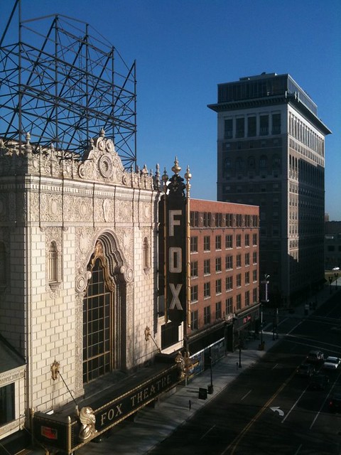
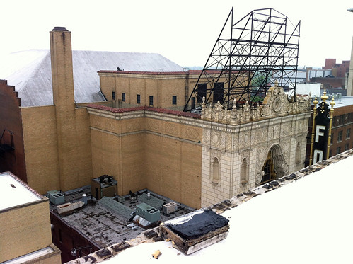
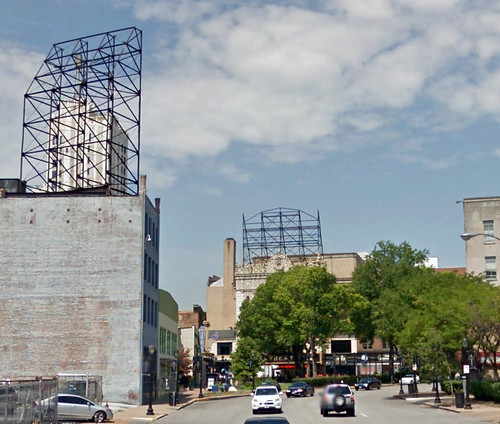
 Last week I heard on the 10:00pm news that the steel sign frame atop the Fox Theater was being removed. The spokesperson for the Fox said that the frame was being removed due to the deteriorating condition of the structure. Several photos of the removal can be seen on the Fox Theater's blog.
 The sign frame towered above the theater with the top of the structure rising higher than the roof of the eight story Metropolitan Building, which recently re-opened across the street.
 While the sign itself has been gone for decades, the steel structure on the roof was very much a part of the building. Its removal brings up some questions about what should be considered significant to a buildings history. Just because a building element is not made of brick or terra cotta, does that mean it is not worthy of significance?
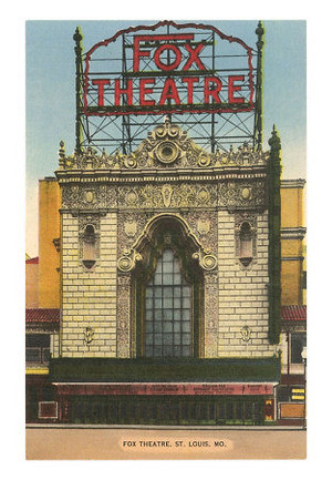
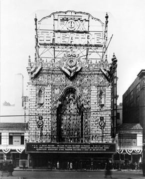
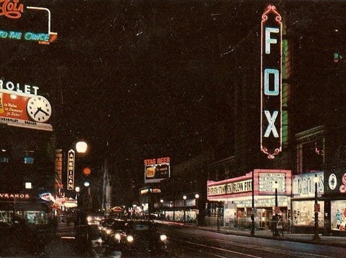
The sign frame was an integral part of the Fox Theater's facade since its opening in January, 1929. The frame supported a massive sign composed of individual letters that were about 8-10 feet tall with a decorative filigree border, all of which was lit with neon. The Fox has been individually listed on the National Register since 1976 and is also a part of the Midtown National Register Historic District.
 Another early view of the rooftop sign from the Fox Theater website. The Fox's location at the end of the Washington Avenue view corridor and the high elevation of Grand Boulevard explains the location of the rooftop sign, which was not found on most other theaters in the district. The sign would have been visible down Washington almost to Jefferson where the street curves slightly.
 The four-story building that is the new home of KDHX also has a large sign frame on it's roof. The sign faces the angled section of Washington Avenue that was constructed to join with the portion of the street west of Grand. It is also visible to anyone driving south on Grand and of course the throngs of theater goers at the Fox.
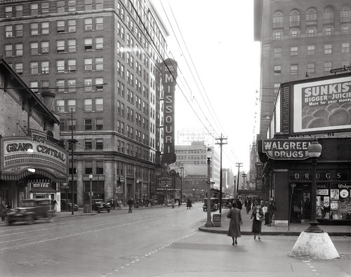
 In its heyday, the theater district along Grand, which was known as the "Great White Way" of the Midwest had many lighted rooftop signs. Even a simple one-story building further north on Grand was lined with rooftop billboards. Eventually, as part of an effort to "de-clutter", the City of St. Louis outlawed rooftop signs and now any new ones may only be constructed after obtaining a variance. Photos above and below from the Pyramid Companies archive.

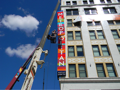
 While Grand Center lost the Fox Theater rooftop sign frame, in the same week, a new 40 foot tall sign lighted sign was hoisted onto the corner of the recently opened Metropolitan Artist Lofts. I would be curious to know the cost estimates for repairing instead of removing the sign structure at the Fox.
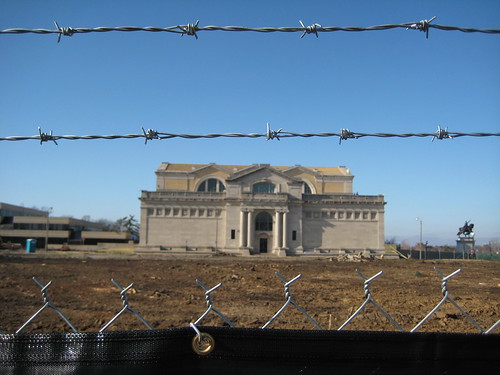
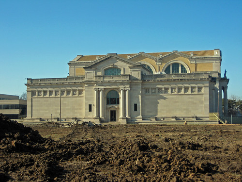
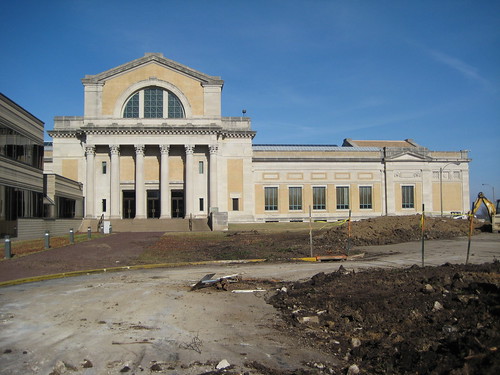
 A few years ago I attended a talk by architect David Chipperfield in the auditorium of the St. Louis Art Museum. In discussing the design approach for the then proposed museum expansion, Chipperfield said that the design would respect the original Cass Gilbert museum building. Upon seeing the proposed design, and now having seen it constructed, I am not so sure that respect is the word I would use to describe how the addition treats the Palace of Fine Arts. Above is a last view of the east elevation of the museum in January 2010.
 I am not so concerned with the design of the addition structure itself. It is certainly not a stunning design that you will see splashed across the pages of architectural periodicals, but it is not an awful design either. The renderings of the interior lead me to believe that once inside, the addition will be quite attractive.
I am thrilled that the museum will be gaining additional gallery space, which will theoretically allow for the un-crating of a percentage of the museums large collection of works that sit in storage due to lack of space. I am not so thrilled with how the new Chipperfield addition relates to the original museum. One problem is how the new building was attached to Cass Gilbert's masterpiece.
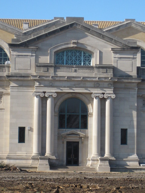
 This was the east entrance of the St. Louis Art Museum just before construction of the addition started. The entrance had not been used as an entrance for many years (possibly decades), but the lack of functionality did not diminish its presence. Once construction commenced, I have been told by two different sources, that the beautiful stone engaged Ionic columns were unceremoniously chiseled off of the building! It remains to be seen what other other changes were perpetrated to Cass Gilbert's work, but my guess is that the stone doorway, pediment and arch met a similar demise.
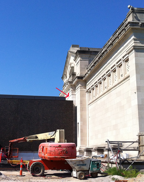
 The entablature of the east entrance survives but is nearly hidden behind the solid black box that has smashed squarely into the east face of the museum. Where the columns were removed, flat stone has been added to meet the new addition. This complete lack of sensitivity to the historic fabric of the original museum is unprecedented in even at the height of the modern era when so many classical buildings were defaced.
 This is a 1959 model of a multi-phase museum expansion designed by the architectural firm of Murphy & Mackey (image from Missouri Digital Heritage). Notice how the planned east and west wings would have attached to Cass Gilbert's Palace of Fine Arts only at the flat portion of the stone facades, below the decorative frieze and leaving the east and west entrances fully intact and functional leading to secure outdoor sculpture courtyards. Only the south wing of this plan containing the auditorium and restaurant was executed, opening in 1960.
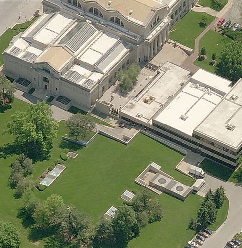
 In 1978, alterations and an expansion of the south wing by Kivett and Meyers actually removed the two portions of the Murphy & Mackey addition that had attached to the original building at the main floor level, leaving only the lower level connection. While the Kevett and Meyers alterations wrapped Murphy & Mackey's auditorium with what looks more like a suburban office building, it paid the utmost respect to Cass Gilbert's original museum. Removing the mostly glass main level connection immediately adjacent to the south entrance though did make getting to the restaurant and auditorium somewhat awkward.
 Beyond how and where the Chipperfield's addition attaches to the existing museum, there is the relationship between the new structure and the existing museum. Instead of configuring the addition so that there could be usable outdoor courtyards like in the Murphy & Mackey design, Chipperfield left only about a 20 foot gap. This is just enough to let light in windows, but too narrow to be a useful space. In placing the building so close to the existing museum, much of Cass Gilbert's south and east elevations are unintelligible.
 This is a view out of one of the lower level windows in the original museum showing the close very proximity of the new addition.
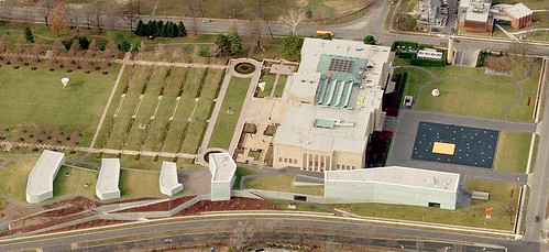
 In complete contrast to the addition to the St. Louis Art Museum, Steven Holl's solution to adding space to the Nelson Atkins Museum of Art in Kansas City provides 165,000 square feet of galleries, offices and other facilities without overwhelming the original 1933 Beaux Arts structure. The addition was completed in 2007.
 The connection to the new addition occurs at the Beaux Arts building's lower level, so that all elevations of the original structure are completely unencumbered by the new building. Much of the addition was constructed below grade and has grass covered roofs punctuated by the glass "lanterns". The addition is quite spectacular at night and overall it is a much more dynamic building than Chipperfield's conservative solution. Steven Holl's website project page has several great photos.
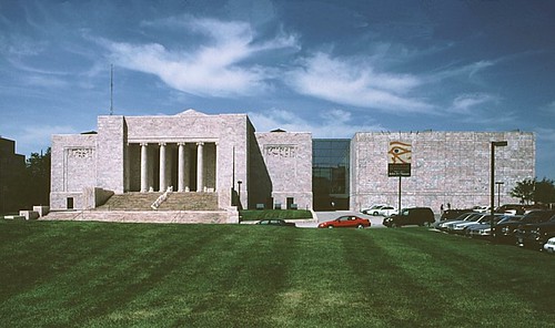
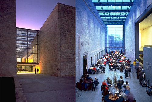
 For the addition to the Joslyn Art Museum in Omaha completed in 1994, Sir Norman Foster restrained himself from his usual high-tech designs with a simple large box clad in the same Georgia pink marble as the original 1931 Moderne museum. The addition nicely compliments the museum and attaches to a large area of the side of the structure. But original facade is fully intact and becomes the interior wall of a large glass atrium that connects the buildings and functions as a lobby, sculpture space, cafe and event space.
 Joslyn image sources: exterior, atrium
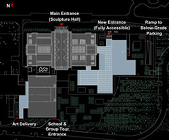
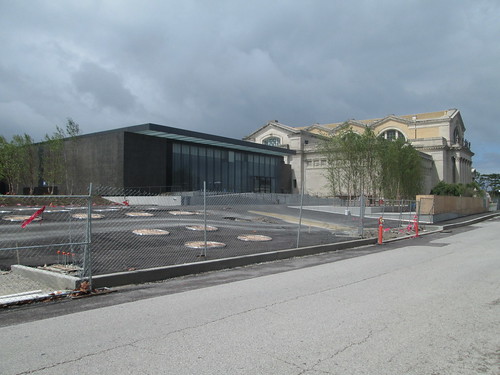
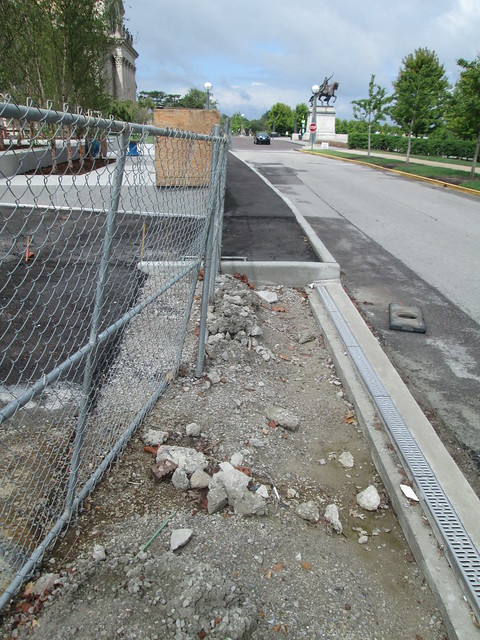
 Between the drop-off drive in front of the new front entrance and the ramp to the new underground parking garage, which accounts for over 60% of the square footage of the addition, is a sea of sloped asphalt with groupings of round openings, which I would presume to be tree wells. This is not exactly the most attractive material choice compared to the materials of the building itself, and yes the sidewalks are asphalt as well!
 The corners of the driveways for the entry drop off and garage ramp are square, which I'm sure looked good on a plan, but won't work so well in reality since cars don't turn at right angles. All of the driveways also lack accessible curb ramps at the sidewalks.
 Rarely does this blog delve into commenting about additions to buildings. Rarely though in St. Louis do building additions come to affect such prominent architectural treasures as the St. Louis Art Museum. While our fair City is blessed with a seemingly never ending plethora of beautiful historic structures from single family homes to highrises, I could probably count on one hand the number of buildings in St. Louis that combine such an amazing site, importance of use, prominence to the public, and of course a spectacular work of architecture as Cass Gilbert's Palace of Fine Art. Before commentary about the current expansion though, we should take a look at the museum's beginnings in Forest Park and an early unexecuted concept for its expansion.
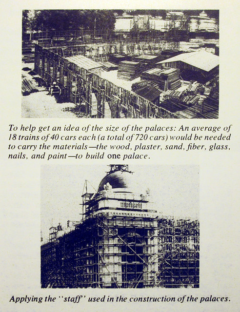
 Many St. Lousians are familiar with the knowledge that the St. Louis Art Museum was the only permanent building constructed in Forest Park for the Louisiana Purchase Exposition, the World's Fair of 1904. All of the other great palaces for the fair were built as temporary buildings constructed of wood and a plaster material known as staff. The buildings were essentially giant stage sets that were dismantled after the fair.
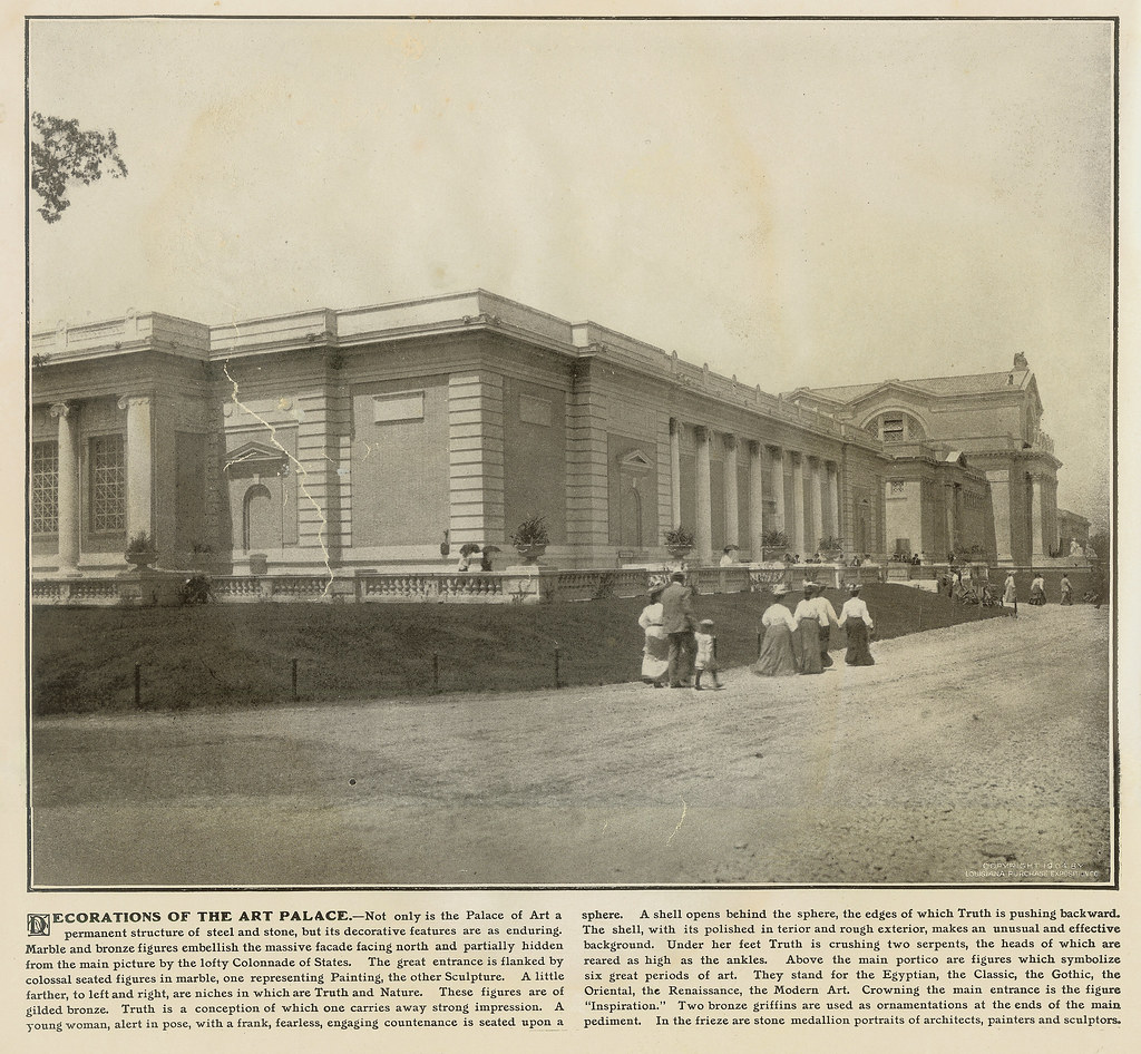
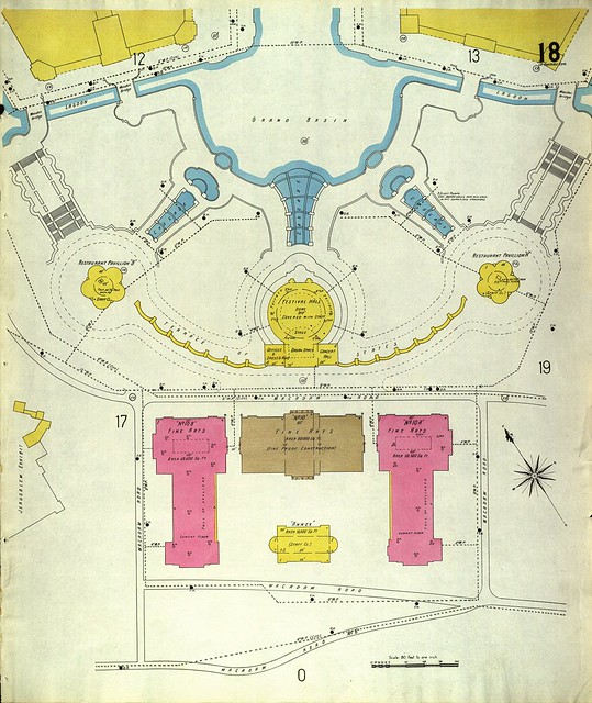
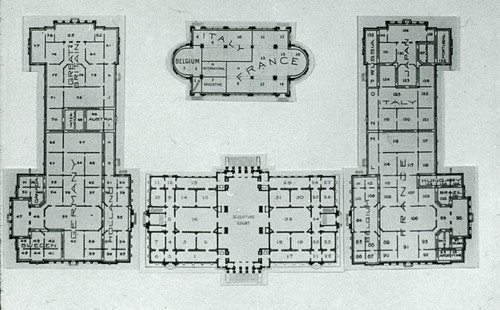
 What many may not know, is that during the fair, the Palace of Art was actually composed of three large buildings designed by Cass Gilbert and a small annex. The Sanborn map below shows the Art Museum as we know it as the fireproof structure shown shaded brown as having an area of 60,000 s.f. The photo above from a large book The Official Photographic Views of the Universal Exposition shows the Art Palace complex with the east pavilion in the foreground.
 On each side of the main museum building were what have been called temporary pavilions, each with an area of 68,600 square feet (the new expansion will have about 80,000 square feet of new gallery and public amenity space). The puzzling part is that these pavilions were not made of wood and staff, but are shown on the Sanborn map as being constructed of masonry, which seems odd for temporary structures.

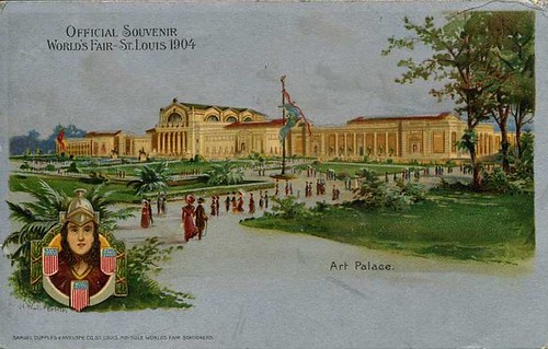
 A official souvenir postcard depiction of the Art Palace complex shows the panels between the columns of the east and west pavilion buildings as light brown in color, which were probably the same buff colored brick that can still be seen on the clerestory and rear elevation of the main museum building. If the east and west pavilions were always intended to be temporary, it is likely that the columns, cornices and other decorative features were constructed of staff.
 The south elevation of the St. Louis Art Museum just prior to construction of the new addition.
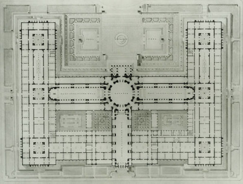
 In 1915 the trustees of the City Art Museum commissioned Cass Gilbert to design an expansion of the museum. Gilbert responded with a massive scheme completed the following year, which would have been about eight times the area of the original structure. The sculpture hall would have been lengthened to the south and culminating in a large dome at the center of the complex. To get an idea of the scale of the concept, in the rendering of the north elevation above the ends original museum align with two large fountains in the grand basin and the new wings, each the length of the entire original building extend to the east and west.
 In the plan above, the corner rooms of the original building are joined by narrow galleries to the new central spine containing two additional large sculpture halls forming what appear to be two square courtyards, but are labeled atriums. The expansion designed to be constructed in phases for which Cass outlined construction costs in February 1917. The total estimated cost, which was broken down into 15 potential phases, was just under $8 million. The estimated cost was for the building components only.
In true City Beautiful style, the expansion scheme site plan is also nothing less than grand with a series of linear pools and symmetrical tree lined allees extending to a traffic circle with a monument on Lindell Boulevard. The Jefferson Memorial of the present day Missouri History Museum, which had been constructed in 1913, is just left of the traffic circle. The site plan was heavily influenced by remains of the site plan for the World's Fair, which also extended along this axis with the fair entrance on Lindell.
 In 1917 Harland Bartholomew and the City Plan Commission published Problems of St. Louis, which outlined issues associated with the City's growth and necessary future improvements. Among topics of transit, streets, distribution of park space, curing "housing evils", the need for a large expansion of the City Art Museum did not show up as a priority.
