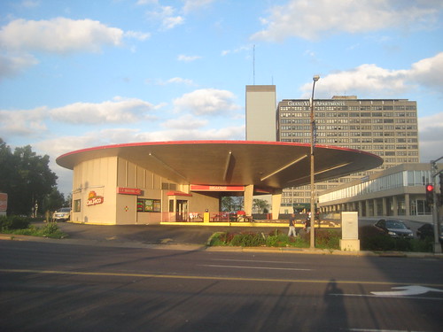
When most of us think of "pedestrian friendly" retail, we think of great streetscapes with wide sidewalks, street trees and good urban buildings built up to or close to the property line along the back edge of the sidewalk. Thats great if you have a street lined with urban structures, but lets face it, Grand Boulevard in the vicinity of Forest Park Boulevard is never going to look like South Grand or the Loop. SLU missed their chance when they turned the expansion of Busch Hall inward to a food court. I don't see them building urban student villages along Grand in front of Reinert Hall, Marchetti Towers, Griesiedieck Hall or the giant Laclede Garage any time soon.
With this in mind, tearing down the iconic Flying Saucer to build a single new 7,000 s.f. building built up to the sidewalk at Grand simply makes no sense. The Council Plaza complex was designed and built when the automobile was king. People who lived there, went to the union hall, medical offices and on-site restaurant generally arrived by car, and before there were tacos, they bought their gas or had the car repaired at the Flying Saucer. As with designs typical of the period (and now the norm in suburbia) the sprawling low slung former Teamsters Plaza building, which now houses the Flats at 374 is set back about 60 feet off Grand. While it would be possible to fill the gap by building on that 60 foot setback, unfortunately this would probably compromise the historic integrity of the building, and therefore the tax credits for the recent rehab. This might be possible after the five year recapture period though.
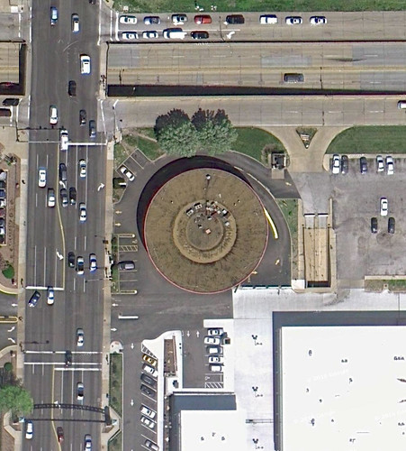
The problem with the Flying Saucer is not that it is set back off the street. The problem is that it is surrounded by asphalt, has a redundant driveway off Grand front and center, and is surrounded by a public realm that is anything but pedestrian friendly. So what can be done?
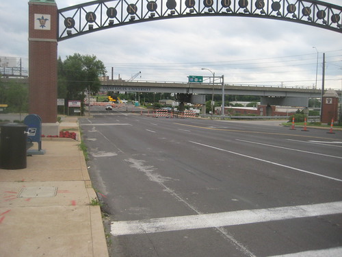
First, one would hope that the restaurants that are looking at the location do not have drive-thrus, which would allow the building to be freed from its asphalt collar, with placement of most of the parking at the rear of the site, shared with the adjacent residential buildings. Second, get rid of the front and center driveway off Grand. Next, add street parking on Grand. The right lane of Grand just north of Highway 40 strangely bumps out all the way to Forest Park with a width of about 19 feet, which could be split into an 8' parking lane and 11' traffic lane. About 11 spaces could be added along the Council complex in two areas. Curb bulbs into the parking lane at the Council Plaza entrance and at the Forest Park corner would improve street crossings.
While we are at it, the City could easily put Grand through this area on a road diet. The new Grand Boulevard bridge over the railyard will only have 4 traffic lanes, and Grand reduces again to 4 lanes plus a center turn lane north of Lindell. It stands to reason then that the present 6 lanes plus a center turn lane could be reduced to 4 from the new bridge south of 40 all the way to Lindell. I would split the extra lanes to provide a dedicated bike lane on each side and add a tree lawn between the traffic lanes and the sidewalk, which are side by side along this entire stretch. Sidewalks next to the traffic lanes are desired in commercial districts, but in areas where street parking is not present, a tree lawn provides a buffer between traffic and people.
Creating a better pedestrian and biking realm in this area would connect Grand Center to Metrolink, it would connect SLU's main and medical campuses and all of this would bring more potential customers to the Flying Saucer while reducing the amount of parking needed.
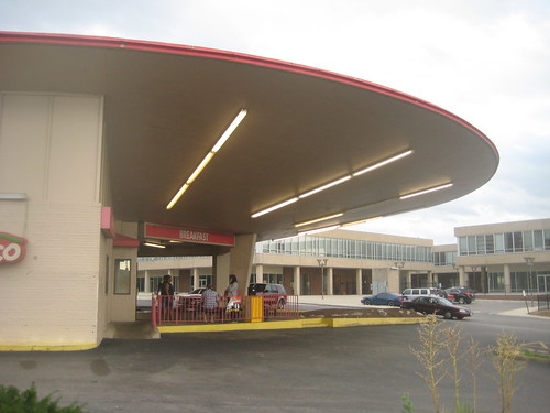
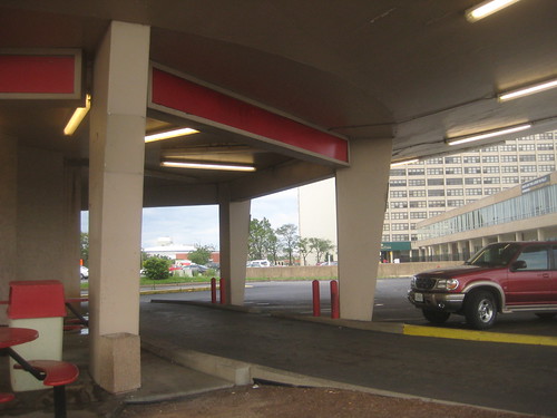
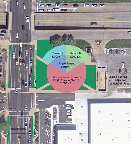
Back to the building itself, the site & building plan above shows how the Flying Saucer could be just right for a 3,000+ s.f. tenant. As one friend on facebook suggested, maybe this could be a Starbucks, although I would prefer a Kaldi's. Removing the asphalt could open an expansive 7,000 s.f. outdoor covered terrace that could become the place to be seen in Midtown. The developer, Rick Yackey has talked about the possibility of two tenants. With a sensitive radial addition on the current drive-thru lane the building could be expanded to about 7,000 s.f. The height of this would want to be kept low, allowing the clearestory windows of the original building, which are now painted over, to be retained and re-opened. All of the service functions such as food prep, storage, restrooms etc. could go in the low addition, leaving the spacious sloped ceiling volume of the original building to be opened for seating. While some preservationists might cringe at the thought of alteration, I think it would be far better tan a wrecking ball.
The bottom line is that Rick Yackey, Marlene Davis, and the rest of the Board of Alderman need to understand that there are many possibilities to preserve and re-use one of the most unique pieces of architecture that we have in St. Louis. The Flying Saucer, which was finished just a year after the Gateway Arch is a legacy from a time when people thought nothing was impossible. Remember that little thing about going to the moon?
This is a time to throw out preconceptions, and it is also a time when YOU can act to show how this is possible. Tomorrow, Wednesday June 29th, the Housing, Urban Development and Zoning Committee of the Board of Alderman will hold a public hearing regarding the proposed demolition, which is part of Board Bill 118. The HUDZ Committee has the power to change or kill the bill. Please take time from your day to show up to City Hall, Room 208 at 10:00 am to voice your opposition. This may be the public's only chance to stop the demolition.

4 comments:
"The height of this would want to be kept low, allowing the clearestory windows of the original building, which are now painted over, to be retained and re-opened. All of the service functions such as food prep, storage, restrooms etc. could go in the low addition, leaving the spacious sloped ceiling volume of the original building to be opened for seating."
Yes. This is what I have been envisioning, and nearly exactly. I visited the site yesterday, got some krinkle cut fries from the drive-thru, and made the same observations. While your diagram seems to state the space planning obvious, it's just this obviousness that is not being mentioned enough when considering adaptation possibilities. I would, however, bring the radius further toward the edge, and reach out to the southeast corner of this intersection. I would provide for a future BRT stop and transit shop, and a walking food vendor for the SLU kids. They all love that New York style pizza.
I would be tempted to turn your plan 90 degrees with the spaces opening up to Grand-think of Kaldi's in Kirkwood with a large terrace facing Grand. I think both of us are dreaming though, but interesting to see that this building is getting so much attention.
If Starbucks goes in there, that drive through will stay.
There are many ways that the existing building could be altered, adapted or added to. And yes, if Starbucks moved in, the drive-thru would probably stay, which if the building gets re-used, would be fine with me.
Post a Comment