A commentary by Kara Clark Holland and Paul Hohmann
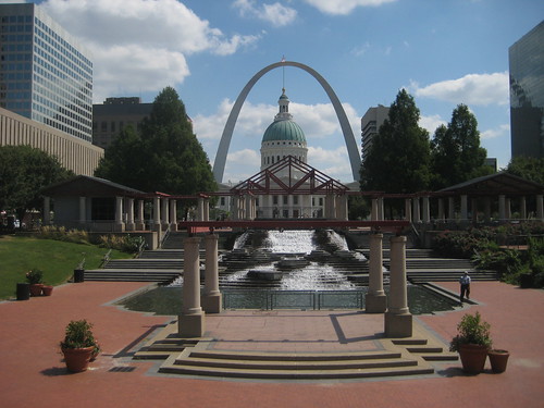
Recently HOK unveiled a proposed design to replace Kiener Plaza and the Morton D. May Amphitheater. The question is though: is this really necessary? Do we really need to completely re-design our public spaces every few decades? Kiener Plaza which was originally bounded by 6th, Broadway, Market and Chestnut was dedicated in 1966, the same year as the Gateway Arch, so admittedly this block is now 43 years old, but the Morton D. May Amphitheater was dedicated in 1987, a mere 22 years ago.
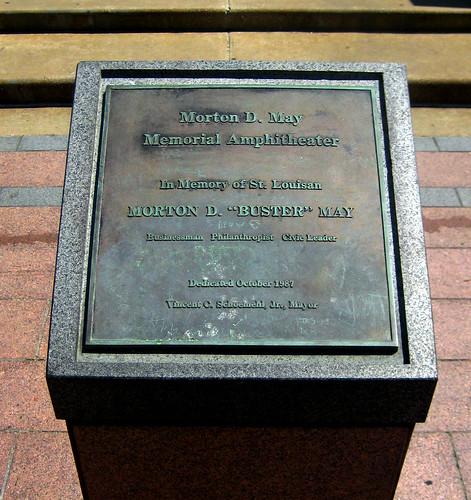
Morton D. May Amphitheater dedication plaque from 1987
While some might claim that the Kiener Plaza and Morton D. May Amphitheater look dated, we say lets be careful about using such subjective terms and even more cautious about replacing “dated” with the architectural pastiche of the day. While both designs are elegant in their own way, the current design of the amphitheater and the adjoining plaza has a greater chance of enduring over time. The architecture of the May Amphitheater was inspired by the Old Court House, which is part of the National Landmark Jefferson National Expansion Memorial. The proposed design however already looks dated to us. It’s design is reminiscent of images that have been published in architectural periodicals over the last few years. The desires for something new and flashy are symptomatic of the Bilbao Effect. Just like the fashion images from the pages of Vouge, these styles will only be trendy for a few seasons, if that. The current designs are more formal, tying into the Old Courthouse and Arch better, and are more likely to endure over time.
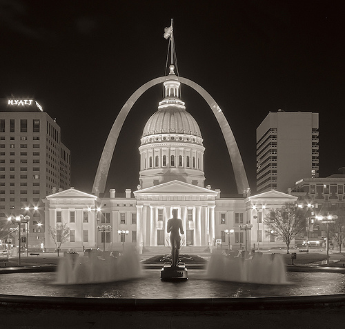
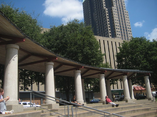
From a functional standpoint, the May Amphitheater still serves many purposes well on a daily basis. Lunch crowds from nearby Downtown office buildings gather daily to enjoy a bite to eat, catch a few rays of sunshine, read a book or simply to people watch. At Kiener Plaza, the benches that surround The Runner are rarely empty. This is an even better place to people watch due to the number of people who criss-cross the plaza on the way to another destination. For sports rallies and other special occasions, the current May Amphitheater functions very well. The proposed design does not appear to have much slope up from the stage area and would likely not have great sight lines.

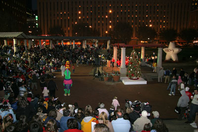
Macy’s Festival of Lights – 2008. Photo from Partnership for Downtown St. Louis website.
The current design of the two blocks offers both intimacy and a large open space for events. The proposed design has a grand feel with an open expanse, but lacks intimacy. This is good for planned events, but it would require those large crowds to feel inviting. In the present Kiener Plaza and May Amphitheater, a person can feel comfortable even if they are the only one there. The current design offers multiple options for shelter, and better connectivity to all sides and corners of the surrounding blocks. The new design doesn't offer much shelter (and very few trees) and only seems to offer good connections along a NW-SE axis.
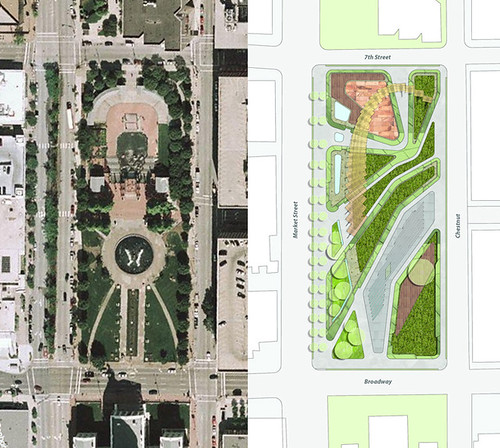
The present and proposed designs of the two blocks.
Then of course there is the cost. The budget for Old Post Office Plaza was $8.8 million for the 30,000 square foot area, or about $160.00 per square foot. Construction cost for nearby City Garden was $30 million for the 2.9 acres on two City blocks, or about $174.00 per square foot. City Garden is about the same size as the Kiener Plaza – May Amphitheater blocks.. Should we spend $30 million to completely replace what we have? No. Spend this on some of the blocks farther west that could really use some attention.
Do the existing spaces need some re-furbishing and enhancements? Yes. At the May Amphitheater, the asphalt perimeter paths, likely a last minute value engineering decision, should be replaced with a more appropriate paving, new access paths should be installed where landscaping gets regularly trampled, and new shade tolerant ground cover should be planted under the existing tree canopy. At the floor of the amphitheater and terraces to the south, adding movable umbrella tables would provide an additional shaded seating. The information center building should be re-designed to be more open with largely glass exterior walls. A companion building could be built to the south to house the nearby hot dog and concessions stand.

Asphalt paths and lawn areas around the amphitheater need to be addressed. The trees though, which provide pleasant shade and an intimate setting should remain.
At Kiener Plaza, concrete paving should be patched or replaced with matching where necessary, more benches should be added around the fountain, cobblestone edging and the cobblestone ring around the fountain need refurbishment. The lawn areas east of the fountain do seem to lack definition and could use something to add interest and encourage more use of the spaces. Something as simple as adding large topiaries could break up the lawns into more intimate spaces that are more likely to be used.
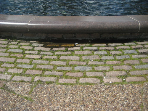
Cobblestones around The Runner should be re-worked.

People enjoying the intimate lawn spaces in front of the Naturhistorisches Museum in Vienna
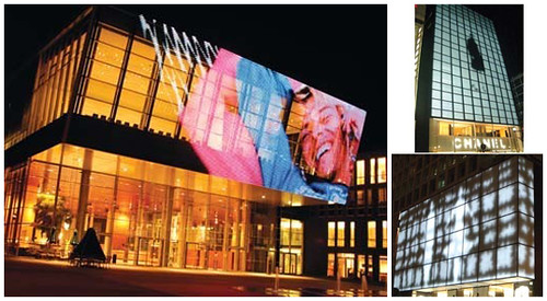
One of the worst things about these two blocks is the view of the Kiener garages to the north with all the garage entrances along the street. Neither design is at fault for this drawback. At the May Amphitheater, at least the current design shields the majority of the view of with a row of trees. At Kiener Plaza, where more of the east garage is visible, simply stretching a metal mesh with an integral LED array could turn the garage facade into a giant video screen which could be programmed with regularly scheduled movie screenings and video art displays.
By spending a few million dollars on needed renovations and selective enhancements, Kiener Plaza and the Morton D. May Amphitheater could live up to their premier location. Throwing away everything in these two blocks for wholesale replacement would be extremely wasteful. The only advantages we can see with the proposed new design is that it's new and shiny, bold and flashy. These qualities wear off quickly.

12 comments:
They just want to build CityGarden II.
I think there are many more pressing issues than re-designing this area. Some moderate repairs are all that is needed...
Vouge?
It's all part of that disposable/replaceable mentality that the US is infamous for. From food containers to cars and furniture we habitually throw something out when it starts to show wear and replace it with newer shiny versions. City planners should be smarter than that.
The few aspects that are reflective of the formality of the Old Court House in the existing design are the strict axiality, the classical language of PoMo, and the semi-circular canopied seating terraces (that I suppose could somehow reflective of the courthouse dome) don't ascribe any more value to its existence in comparison to the new design. Beside that, I wholeheartedly agree with your assessment of the intent to redesign this open space. As with City Garden, it is much easier to appear as if progress is taking place when existing open spaces remain open, but with some expensive cosmetic changes. This is NO need to redesign Keiner Plaza, as ther was no need to construct City Garden (despite how well-designed and pleasant the garden happens to be). There are NOT ENOUGH PEOPLE downtown to support so many deliberately designed open spaces, and the City Garden site should have been built out with new real estate when the economy would permit. It is now too late for that.
The only thing that the existing Keiner Plaza really needs (beside the updating of the existing little building enclosures flanking the amphitheater) is the filling of the two grassy areas surrounding the fountain with mature trees. Leave the central axis open for visual connection through the dome and to the Arch, but allow the rest to become a small 'forested' urban park that is ordered appropriate to its formality. The mesh screens masking the garages is a great idea, and one I've suggested before, and it would be very appropriate for this site. The point being made by your post should be accompanied by a graphic representation of the ideas herein. We, as urbanists, are saying here's "WHAT'S THERE", and then saying here's "WHAT SHOULD BE".
Great post - really got me thinking about this space.
I've never been a fan of Kiener Plaza, and (lacking any formal architecture/design/urban planning training) it's been hard for me to articulate exactly why. I actually like many aspects of the HOK plan, although I kind of wonder why the firm that designed City Garden isn't involved in any redesign of Kiener.
I don't like the formality of the eastern portion of the plaza. It's not inviting, and the narrow walkways don't draw pedestrians in.
The benches are of a weird, uncomfortable design. Maybe I have a weird body, but I don't "fit" the benches' contour. Just putting in new benches would be a huge improvement. It would be great to have more seating options beyond the awful benches and the terraces of the amphitheater.
I'd also like to see more diversity in the way of trees and other plantings. I like your idea of topiaries.
The idea of covering the garages with LED mesh is a fantastic one that I think should be pursued before anything else is done to Kiener Plaza.
The design of the ampitheater seems very tired to me - it definitely has a dated 80s feel to it. I would be interested to see how it could be refreshed and updated instead of just being completely replaced.
Removing the horribly cheesy trusses above the bandstand would be start.
Clarification- remove the trusses above the public speaking platform atop the water feature and to the east of the amphitheater. The simply trabeated 'enclosure' of bandstand in the amphitheater is harmonious with the terraced seating canopy. I hate those trusses.
Ok, those LED mesh video arrays are way too cool. Oh man.
OMG!!! Every time I check out this blog I am struck by yet another act of unnecessary civic destruction by the city fathers of St Louis!! I can say with credentials that the old plaza does lack certain quality of materials that could easily be upgraded and some elements need redesigning BUT it is a known fact that people would find this upgrade far more satisfying, interesting and fulfilling as far as civic pride goes than the gutting and replacement of the whole damn thing!! Not to mention that the new design seriously SUCKS. Your city is in some serious trouble are you sure SL hasn't fallen into some time warp and its the 1950s all over again..... NEW NEW NEW ASYMMETRY RULES IF ITS OLD TEAR DOWN WE WANT A CLEAN MODERN METROPOLIS!
I agree... DON'T FIX WHAT ISN'T BROKEN!!!!!!
The City Garden was a great addition to the city, no doubt. Keiner reno is not necessary. Having worked downtown for several years, it's the center of downtown dialy activity and people love it the WAY IT IS.
LED video arrays would simply become huge visually assaulting Bud Light billboards.
Post a Comment