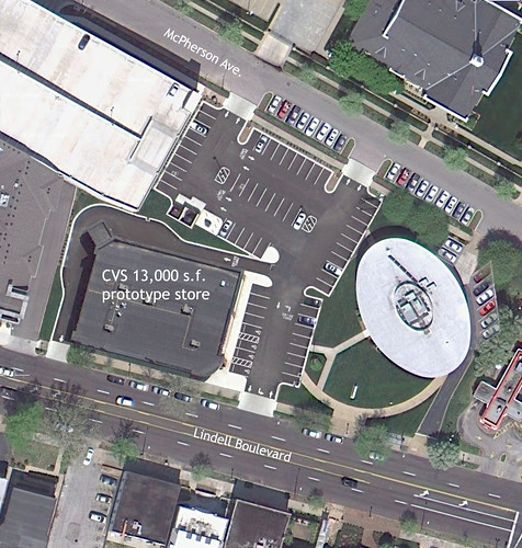
Last week I posted about how it is very possible to build a new CVS store on Lindell Boulevard and still preserve the unique AAA building. While it works, I was not very happy with what I had come up with from an urban design standpoint, with the new store set back from the street and parking in front. I also felt that the new building crowded the AAA.
I had initially thought that setting back was the only option to achieve a decent parking configuration due to the odd shape of the site which has the garage from the mixed use retail/apartment building to the west jutting into it leaving a shallow area at the west side. After thinking about a friends idea about the site layout, I took another look to see if I could improve things. What I found was that turning the new store sideways allows it to fit into the shallow part of the site with little setback at the sidewalk and still have a drive-thru. This places the building in line with the mixed use building to the west, places most of the parking in back (total 62 spaces) and gives the AAA building more breathing room.
Ideally, the new building might start with no setback at the west end, aligning with the adjacent retail/apartment building then curve or angle back towards the AAA building which is set back from the sidewalk. CVS however likes their box floor plans and the constraints of the site would not allow the building to be rotated without losing parking. A box though can be well designed.


5 comments:
Paul, would this plan necessitate AAA keeping their offices in the oval building or moving elsewhere? i thought part of the deal was for a new AAA building somewhere on the site... of course i prefer your plan but i'm concerned that they won't go for it if it doesn't include a new building for AAA.
^ Right. I believe part of the deal was that AAA wanted out of the old building.
I like the New Formalist CVS. Very in keeping with the area's style!
The design needs a better ped connection from McPherson and the parking spaces back there as well. This is an awesome idea.
Make it more than one story with office space above?
Post a Comment