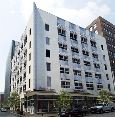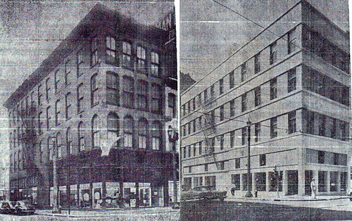
Another example of an early 20th century building Downtown that received a new modern slip cover is the Farm & Home Savings Association at 10th and Locust. The current modern skin was applied to the building in 1954. Farm & Home had purchased the building for its new St. Louis headquarters.

The six story building was originally constructed in the Romanesque style in 1905 as the central exchange for the Kinloch Telephone Company. In 1900 Kinloch had surpassed the rival Bell Telephone Company in number of subscribers, making it St. Louis' largest telephone company at the time. Kinloch sold out to Bell in 1924.

Back to the question of whether a "modernized" building can be restored to its former appearance. The answer as seen in my previous post is: sometimes yes, but in this case, the answer is sometimes no. Both the former Post-Dispatch Building and the 1015 Locust Building are both examples of modernizations that were accomplished by hanging an aluminum and glass curtain wall on the building. As the name implies, the new window and metal panel systems were hung on brackets attached to the masonry structure and like a curtain, there was a small amount of space between the new wall system and the building. In the case of the Post-Dispatch, this allowed the curtain wall to slip over many decorative elements that protruded from the face of the building. This allowed for removal and restoration of the areas that were damaged.
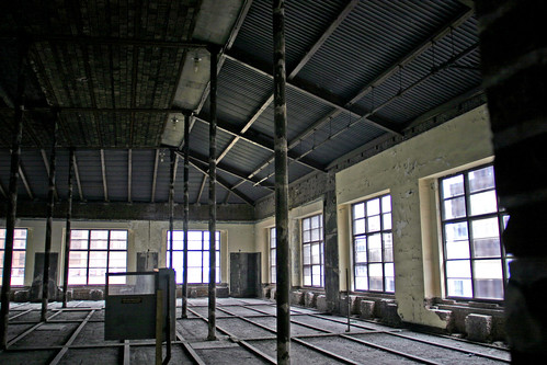
In the case of the Farm & Home Building, a new stone veneer and metal panel system was applied directly to the face of the the original building. This meant that all decorative elements including arches, sills, band courses, cornice, etc. that protruded beyond the face of the field masonry were literally shaved clean off of the building. When Craig Heller bought the building several years ago, he had several of the stone panels removed to investigate the possibility of restoration. As you can see from the photo above, the damage to the brick and terra cotta decoration was extensive. Restoration would have meant a very expensive complete re-construction of all the decorative elements from scratch. Even if the money were available to do this, when damage is this extensive you have to ask yourself "is it worth it?"

Before the complete modernization of the building, apparently Farm & Home considered a more modest remodeling of the facade. As seen in the rendering above, this would have left

Before the complete modernization of the building, apparently Farm & Home considered a more modest remodeling of the facade. As seen in the rendering above, this would have left
much of the original detail of the building intact. Because the Farm & Home modernization had been completed in the mid-1950's, the new skin was able to be considered to have achieved enough significance in the building's history that it was listed on the National Register with the modern facade. The original Kinloch Building photo, rendering above and three side by sides below are all from the building's nomination.

After World War 2, there was a wave of building modernizations in Downtown St. Louis as owners wanted to both "update" the look of their properties and compete with new construction. The building above was at 6th & Olive.
Further east at Broadway and Locust is another example of a prominent building that was modernized in the mid-1950's was the Mercantile Library Building. St. Louis' oldest cultural institution, the Mercantile Library was founded in 1846 and is the oldest continually operating library west of the Mississippi. In 1854 the Mercantile Library built its first building at Broadway and Locust then in 1887 began construction of a larger six story building on the same site which was dedicated in 1889.

In 1955 the building received a modernization very similar to that of the Farm & Home Building. A granite base was applied to the first floor, limestone veneer wrapped its midsection, and finally red brick was applied to the 6th floor and a severely truncated parapet compared to that originally built. The modernization also included a large new addition to the west of the original building as well as the incorporation of a neighboring building to the south an another facing 6th Street to the west.

In 1955 the building received a modernization very similar to that of the Farm & Home Building. A granite base was applied to the first floor, limestone veneer wrapped its midsection, and finally red brick was applied to the 6th floor and a severely truncated parapet compared to that originally built. The modernization also included a large new addition to the west of the original building as well as the incorporation of a neighboring building to the south an another facing 6th Street to the west.

An old advertisement fro marble ant tile shows the opulent interior of the First National Bank of St. Louis which was a main first floor tenant. An image from the Missouri History Museum shows the buildings exterior covered in patriotic bunting on the bank's opening day, July 7, 1919. Prior to construction of the Century Building, Scruggs Vandervoort Barney had also been an early tenant.

This is all that is left of that interior today, although much of the original interior was probably gutted and covered over during the buildings expansion and modernization in 1955.

A photo shows how the large arched windows on the second and fifth floors were partially filled-in during the modernization. Unfortunately the method of attachment of the stone panels here at the Mercantile Library was the same as that of the Farm & Home. All of the decorative features were shaved off to give a clean flat surface for hanging the new stone. Pyramid determined that even if we had wanted to restore the exterior that because the building had lost so much of its original fabric both on the exterior and interior, including almost complete removal of the south and west walls during expansion, that the original 1889 building would not be eligible for listing on the National Register.
A century after it erected its fortress of knowledge, the Mercantile Library found itself an aging institution with dwindling resources. The library was private and relied on memberships and contributions to sustain itself. With a glut of new office space in Downtown St. Louis after the 1980's building boom, the library also found itself almost the only occupant of its now 250,000 square foot building. Instead of closing its doors, in 1998 the Library made the decision to move to the University of Missouri St. Louis campus. Gone is the once opulent sixth floor reading room and the mezzanine library stacks. Like the Farm & Home, the Mercantile Library is eligible for listing on the National Register as a modern building. With this and a now a blank canvas inside, the building is ready to live its next life when the economy is ready.


5 comments:
Fascinating posts, Paul. Thank you!
What atrocities were committed in the name of modernism.
These are titanic posts of immense importance. What an overview of a forgotten theme. Thanks so much for your attention to detail, detective work and extensive use of digital images.
What an amazing collection of photos you've assembled! This is worthy of a book.
I have never found a good shot of the Mercantile pre-modernization. And as for the Farmers building, man, what a facade it had! Historical or not, it'd be a worthwhile sacrifice to loose the slipcover if it could have brought the original design back.
Excellent post! I never would have guessed that behind some of those ugly "modern" facades lie some truly great architecture shamefully covered up.
Post a Comment