Monday evening BMO Harris held an open house in the historic Southwest Bank Building to reveal details about the rumored redevelopment of the bank building that stretches from Southwest Avenue to Botanical through five connected structures built between 1905 and 1973. The site plan above has made two major positive change since it was first shown to neighborhood groups and preservationists in separate meetings in early June.
At that time, the plan showed preservation of the original building at the corner of Southwest and Kingshighway only. The Walgreens was about 20 feet south of what is shown above and the corner building at Botanical would be demolished. The plan has been changed so the corner building is preserved. Since the developer, Draper & Kramer of Chicago does not see any value in rehabilitating the building, they will be donating it to the Tower Grove Community Development Corporation. Also, the Walgreens had been shown with its ass end facing Kingshighway and the entrance facing what they called the "town center", a small area of pavers in the middle of the asphalt (don't get me stated on that one). This has now been reversed so Walgreens face Kingshighway.
The proposed plan still calls for demolition of two contributing buildings in the Reber Place National Register Historic District. The proposal will go before the Preservation Board next Monday afternoon at 4:00 pm in the 2nd floor hearing room at 1520 Market Street. The final agenda for the meeting was posted yesterday and as it should be, the Cultural Resources Office recommendation is "That the Preservation Board withholds
approval of the demolition of the Merit
Buildings unless it finds that the use of the
structures proposed for demolition are not
economically feasible and/or that approval
of the proposed redevelopment will equal
or exceed the contribution of the
structures to be demolished". If you cannot attend the meeting in person, public testimony may be submitted by emailing Dan Krasnoff at krasnoffd@stlouis-mo.gov and Adona Buford at buforda@stlouis-mo.gov
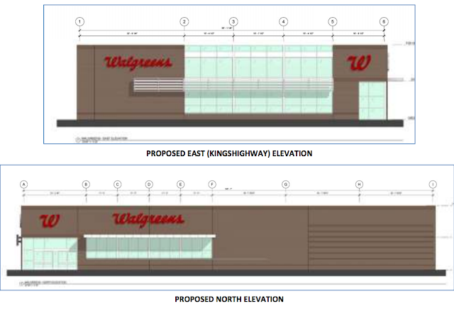
The proposed design of the Walgreens was also revealed Monday, and there were rightly several comments of disapproval from members of the audience. I tweeted that I thought it loos like a suburban Schmucks.
The comments must were obviously taken to heart because the design shown in the Preservation Board Agenda is quite different. It went from boring & suburban looking to basically a bland box. Also, what appeared to be a dual entrance facing Kingshighway and the parking to the north is now shown just opening to the parking.
If the developer wants to go contemporary, maybe they could do something that has some style like this example the Lincoln Park neighborhood of Chicago.
You may be thinking this looks too small for a Walgreens, and you would normally be correct. This store however has a mezzanine level inserted into the double-height interior volume. Photos from dna info Chicago.
In New Orleans, developer Stirling Properties took an old American Legion hall and retrofitted it for Walgreens. After many meetings with area residents and retailers, they transformed the front elevation on Magazine Street with a design that fits well with the historic character of the neighborhood. More info on this project here.
In many cities examples can be found where Walgreens has gone into an existing historic building. In Downtown Atlanta, Walgreens is re-using the former Woolworths space in the historic Olympia Building. The new signage even mimics the Art-Deco style of the original Woolworths, which required extensive restoration work. Rendering from Atlanta Tomorrow's News Today.
Not surprisingly, just down the street is a CVS located in another historic building. Photos from The Ann Arbor News.
In Downtown Baltimore, Walgreens went into this colonial revival, which at least on the exterior seems less suitable than the former Woolworths or Kresge spaces. The did manage to block out the windows though. Photo from Colorodo Traveling Ducks.
In Oak Park, an inner ring suburb of Chicago, Walgreens preserved two street facades of a historic two-story corner building. The contemporary entrance, which also fronts on the street is set back several feet and uses a contrasting brick color to highlight the historic facade. This project was designed by the architectural firm of Camburas & Theodore, Ltd., who also restored a historic bank in the Bucktown/Wicker Park neighborhood for a 30,000 square foot flagship Walgreens Store.
An interior view of the Oak Park store, which features fresh fruit!
The Oak Park example of saving a historic facade could easily be done for the proposed new Walgreens fronting Kingshighway. The 2-story circa 1928 store building in the middle of the block aligns with the new Walgreens, and keeping this Mediterranean revival facade would go a long way toward preserving the integrity of this historic block.
Between the two story 1928 building and the 1905 bank at the corner is this 1923 one story structure. While much simpler in design, keeping the facade of this building as well would further preserve the integrity of the block. This facade should be incorporated into the one-story addition planned for the bank and the remainder used to screen the parking between the bank and the Walgreens with landscaping behind the openings where storefront windows are removed. While avoiding a curb cut here would be preferable, using 2 of the storefront openings could allow the right-in, right-out configuration currently proposed.
Walgreens has shown its willingness to either go into existing buildings or at least preserve historic facades of buildings in other cities and we should demand no less for the proposed new store on Kingshighway.


